CMS and design system intergration (AEM)
Building a flexible, accessible, and scalable infrastructure in Adobe Experience Manager (AEM)
Overview
My role
Senior UX Designer
Team
2 x UX Designers
1 x Visual designer
1 x Business analyst
2 x Full stack AEM developers
1 x Frontend developer
1 x Business analyst
1 x Business analyst
1 x Project manager
Deliverable
Design and implement a new course page template (end-to-end delivery)
When
2023
Two key problem areas
Problem 1
Limited flexibility in Marketing CMS
The University of Sydney’s CMS (Adobe Experience Manager i.e. AEM) relied on customised components and static templates, which heavily restricted the marketing team's ability to create dynamic, modern pages.

CMS templates and components were too restrictive for marketing teams
Problem 2
Lack of design consistency
The site suffered from inconsistencies due to the absence of a unified design system. Developers frequently used local CSS that diverged from the global styles, resulting in a fragmented look and feel across the website.
Example of how buttons varied across the website.

The solution
Unlock AEM’s potential with an design system
I introduced a new suite of AEM templates and components, supported by a comprehensive design system that integrated the university's refreshed visual identity.

I focused on styling AEM core components for flexibility and scalability, ensuring easier updates and versatility in the long run.

I worked on making the hero section visually engaging, being the first point our users will land.

Utilised the 'teaser' and AEM core component for clear sign posting through the site.

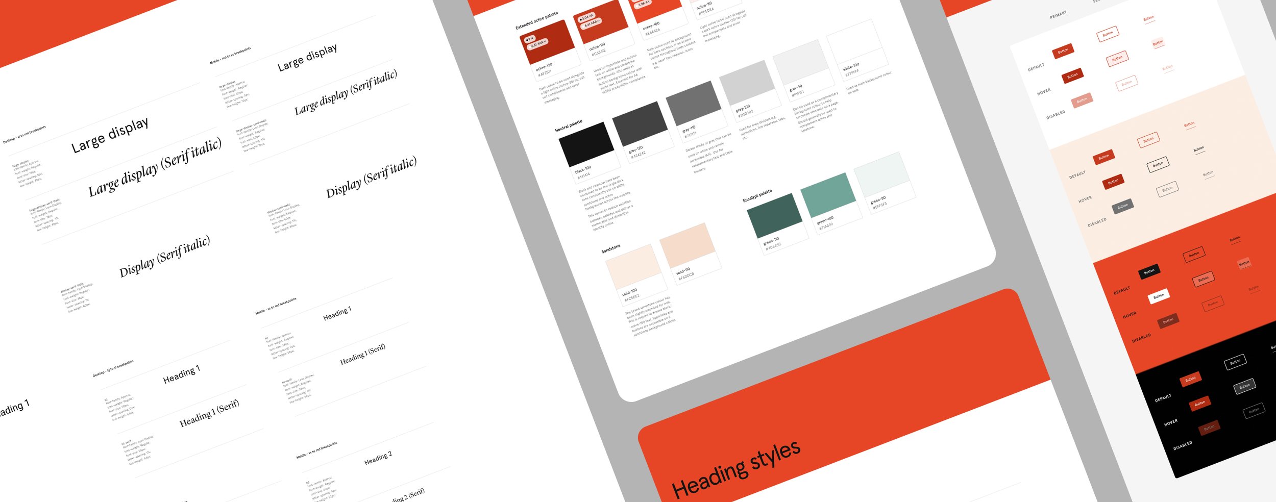
Developed multiple colour palettes with accessibility in mind, ensuring clear contrast for links and button states.

Created marketing components like testimonials and icon tiles to deliver dynamic content and communicate key messages effectively.

Introduced the essential component such as cards, image, and title. This added modular design capability the CMS previously lacked.

Designed the event banner to make upcoming events stand out while aligning with the new visual identity.

Reused design elements at every opportunity (e.g. event card and webinar card).
Aligned with evolved visual identity
This project coincided with the introduction of a new visual identity by the Creative Studio. I collaborated closely with them to ensure that the updated design system reflected this new branding, including the adoption of an expanded and accessible colour palette.

The new design system brought the USYD visual identity to life across the website experience.
Pushing AEM functionality
Leveraging AEM Core Components
I implemented AEM’s core components, introducing modularity and reusability. This enabled faster page builds and updates while reducing ongoing maintenance, as the components benefited from Adobe’s regular updates and improvements.
Editable templates and style policies
By introducing editable templates and style policies, we gave content authors the ability to customise page layouts and design elements (like typography and colours) without developer intervention, ensuring flexibility while maintaining brand consistency.
Set up for personalisation
Integrated experience fragments to streamline personalisation efforts and enable A/B testing with Adobe Target.
I utilised on Adobe’s core component documentation to better align with developers.

Prioritising accessibility
Text size and colour contrast
Increased base text size and expanded colour palette to improve visibility and meet WCAG contrast and accessibility standards.
Screen reader optimisation
Optimised navigation ensuring screen readers accurately convey the purpose and function of each element, along with improved landmarking for key web sections (e.g., header, body, footer).
Embedded accessibility features
This included in web components/templates e.g. flag decorative images, ARIA labelling, heading level restrictions and video transcripts

Hand off specs demonstrated accessible design with clear HTML structure, ARIA labels, and colour contrast.
Introducing tokens
I introduced design tokens to standardise key design elements like colours, typography, and spacing across the system. This ensured visual consistency, improved efficiency in applying updates, and made the design system more scalable for future growth.
Adopting design tokens into the design system

The process
This process involved auditing existing components, researching AEM core functionality, and designing a robust system that could evolve with future needs.

-
Component audit: Reviewed existing custom AEM components
and static templates, highlighting the lack of a structured design system.Research and consultation: Explored AEM core components and consulted content authors to better understand content needs and platform capabilities.
Design, test and build: Utilised AEM core components to design, test, and establish new templates aligned with the new visual identity, adding customisations where necessary.
Apply visual identity to AEM core components
Test content edge cases for robustness and versatility
Modify and/or customise as needed
Hand off to development team
Maintain and develop: Developed guidelines, trained teams, and continued expanding the design system to meet ongoing needs.
Design system stack
We delivered more than just a Figma library, utilising a comprehensive stack to bring the design system to life.

UI library and guidelines
Foundational styles, components, pattern library and templates

Developer documentation
Central hub for technical specs, project guidelines, and team collaboration notes.

Code repository
Managed version control, code reviews, and collaborative development for components.

CMS Implementation
Built and managed the CMS, implementing flexible, accessible templates and components.
Results and impact
Satisfied content authors
The new suite empowered content authors to create engaging web experiences with more flexibility and control, which also boosted morale.

Our project won 2 internal awards for excellence at the University.

Content authors were thrilled to start working with the new CMS suite.
Improved accessibility vitals
Accessibility reporting now shows a significant decrease in errors across key pages that are utilising the new suite, contributing to a more inclusive web experience.
Eliminated critical accessibility issues around heading structure, colour contrast and incorrect use of alt text.

Increased velocity
The adoption of AEM core components has led to a increase in development velocity by enabling the reuse of granular componentry to establish new page patterns and templates.
Other work

Course page template
Designing and implementing a new course page template for the University of Sydney.

Website navigation
Helping users move effortlessly through a large and complex website by designing a cohesive, user-centred navigation system.