Revamping course discovery
On this page
Overview
Problem
Final design and features
Discovery process
Design and iteration
Challenges and complications
Learnings
80% increase in task completion*
40% increase in user satisfaction score*
Design mentioned in ABC news article
*Based on test results of final prototype (A/B test, moderated)
Project lead and designer
My role
2020-21
When
End to end delivery
Deliverable
The problem
Users couldn’t find the information they needed
Prospective students found it difficult to assess course suitability due to cognitive overload, irrelevant and/or missing content.
Previous design
The solution
So, I lightened the load
I reduced cognitive overload by introducing visual hierarchy, on page navigation and interactive components that allow progressive disclosure.
Final design and features


The process
How did I get here?
Situational analysis
I unpacked our challenges
I analysed the state of our content and publishing process, as well as our technical parameters.
No template restrictions
The template didn’t enforce consistent content allowing for an open authoring environment.
No content strategy or governance
No clear ownership or established best practice for content. It mostly written by curriculum managers within Faculties and schools.
Complex content scenarios made it to establish consistency
The complexity of information for courses across the university made is difficult to establish clear, and consistent guidelines.
Database was not fit-for-purpose
There was no database to pull key information consistently.
Highly sensitive content written in legal language
Content on tuition fees and admissions was crafted in dense, technical legal language, complicating readability and negatively impacting user experience.
Project setup
I set the foundations for success
Project pitch
I presented quantitative and qualitiative data demonstrate the problem area. This included bounce rates, user quotes and screen recordings, as well as the comparison visual with other universities.Stakeholder matrix
I mapped out key stakeholders across the university and established a clear decision making process and hierarchy.MVP, milestones and appetite
I established a clear deliverable within the timeframe of one year in order to prevent scope creep.
Empathise
I reviewed what users really want to know
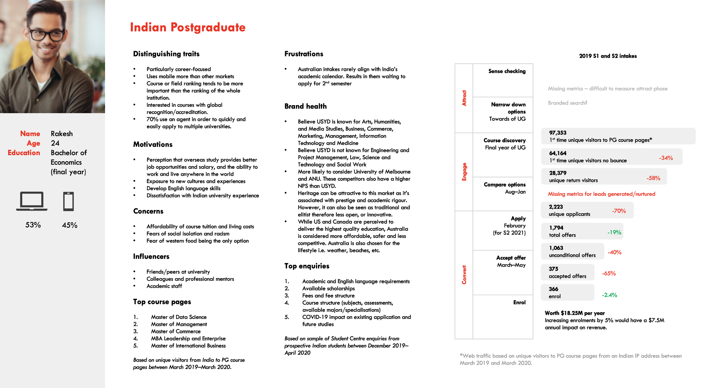
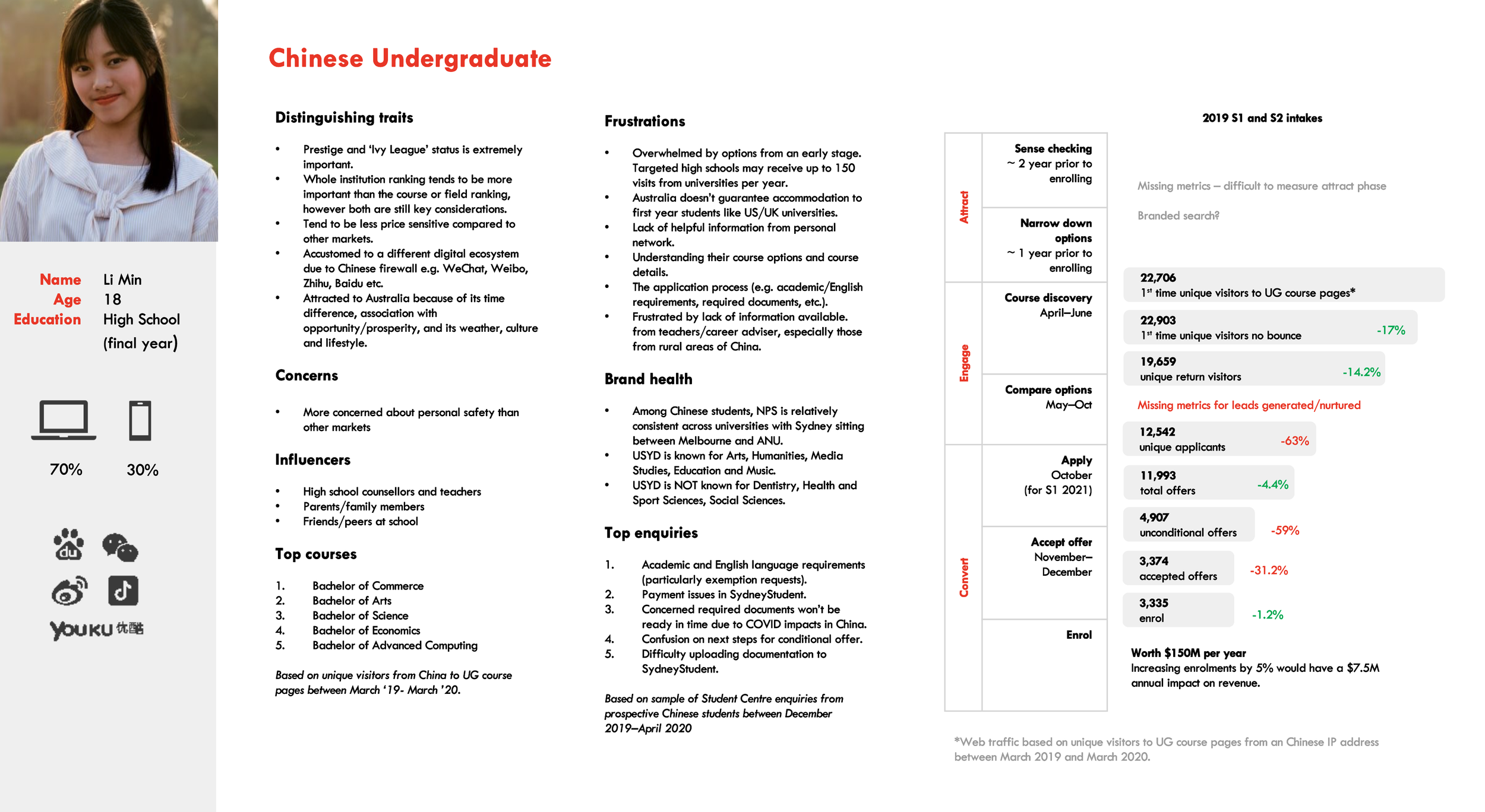
I reviewed my past research on these users which had been synthesised into user personas and journey maps to identify key user tasks.
Users want…
Assurance they’ll learn the skills they came for
This includes curriculum information and the learning experience.Clear financial investment
This includes tuition fees, hidden costs and financial support options.Entry guidance
They look for clear information on entry requirements, application procedures, and necessary documentation.A shortlist
Users quickly scanned course pages to create a shortlist of options to go through in more detail at a later time.


Competitor analysis
I examined the ‘benchmark’?
I analysed competitor universities to explore their implemented features and design elements.
Key features to note
Page navigation
Most sites featured on-page navigation for seamless section jumping.Personalisation
Tailored content catered to both international and domestic students on the majority of sites.Engaging visuals
Enhanced visual elements were prevalent across pages, elevating visual appeal and brand expression.Saving/Bookmarking
Many sites offered saving or bookmarking options for user convenience.
Beyond higher education
I explored ‘outside the sector’
Explored other ‘multi-author’ platforms such AirBnb and CarSales to glean insights and inspiration for design strategies.
Progressive disclosure
Platforms utilised tool tips and modals to house more detailed information without compromising initial cognitive load.Authoring controls
Templates build in authoring controls to enforce content consistency e.g. character limits, dropdown selection, etc.
Design, test and iterate
You know the drill.
Iteration #1
I started with content structure, navigation and layout
I started with the ‘big picture’, working out how it should feel to navigate through the course page and find the information you’re looking for.
Early navigation and layout ideation
Test #1
Quick and cheap testing
I used guerilla testing for the earliest iterations. First with staff in the office, then with any student I could find on campus.
Why? To eliminate bad ideas, fast.
Example of mobile prototype used for testing.
Learnings
Navigation wasn’t visible enough
Users kept scrolling past it.Too many nav items
When using the nav, users got fatigue switching between each tab trying to find certain informaiton.Nav items weren’t clear
Users didn’t always know which nav label held what information.
Iteration #2
A clearer vision emerges
I continued iterate based on my findings.
Key refinements
Reduced number of nav items
Reducing nav items to 4 clear categories. Measured a tab menu could not be missed.Personalisation prompt on entry
Personalisation toggle became a ‘prompt’ on entry for first time visitors.Additional content modules
Began to experiment with specfic modules such as entry score which would have some interaction.
Test #2
Stepping up our testing
Round two was a more rigorous and formalised approach. It involved an A/B test with 10 participants, 45 min remote sessions.
This test involved having 10 participants complete various user task in each design across two designs; a) the current course page vs. b) new design (Figma prototype).
100% success rate (50% increase)
Users had difficulty locating information in the test prompt and often failed to recognise its irrelevance to their domestic or international status.
80% decrease to time on task
Users were asked to find certain information,
80% increase in user satisfaction score
At the end of the test, users gave an average rating of 4/10 to the current design received an average score of 8/10.
Users said the personalisation prompt was annoying
Three participants expressed frustration and found it off-putting to encounter the personalisation prompt for their information before reaching the course page.
Implementation
My work didn’t stop there
I continued to drive project through to build, launch and content migration.
Stakeholder engagement
Selling my design and findings
UX was fairly new to the university. Work was not necessarily well received, particularly by stakeholders in legal and compliance.
Prioritising progress, iterative design over feature fatigue
As I presented designs, I emphasised the importance of our MVP, advocating for enhancements to be introduced iteratively based on data from recent changes.
Technical collaboration and QA support
Desipte technical validation, challenges can still during build and implementation. For example, we ran into unexpected database constraints which hindered our plan to integrate prerequisite information with our course database. As a solution, I quickly created a temporary CSV database to meet our deadline.
Continued collaboration with legal and compliance teams
I refined designs to balance complex legal requirements with user experience, integrating tooltips and modals to present key information at critical moments
Content migration
I set up the team up for the future
Orchestrated and managed the migration of the first 250 courses.
Ran training workshops and materials
Established a content governance models
Created a sharepoint site to design and content guidelines, and governance procedures.
Established backlog of further pain points and feature requests
Project outcomes
Triumphs and takeaways
“The University of Sydney’s website makes direct comparisons easy to do. With other universities, it’s not quite as straightforward.”
⭐️ Wins
Improved experience
Something about the improved experience, mention in ABC news article.
Improved data for more reliable insights
New template structure meant course pages could be better tagged for more reliable and meaningful insights.Establishing a new product team (4 new roles)
4 new roles were created to continue this work, highlighting my ability to demonstrate the importance of UX work within an organisation. =
🧠 Learnings
Carve out something launchable
Focusing on a launchable subset of features would have allowed quicker delivery of a better user experience and earlier user insights.Weed out technical uncertainties early
This helps minimised risk of technical roadblocks late into the project.Pick your battles
Strategically navigating stakeholder feedback by prioritising changes that impact user experience can help avoids delays whilst ensures design decisions align with both user and stakeholder expectations.


