Reimagining University Navigation
Helping users move effortlessly through a large and complex website by designing a cohesive, user-centred navigation system.

Project overview
Project scope and constrainsts
A website navigation system that simplifies movement across the university’s complex digital ecosystem, improving usability, accessibility, and consistency for all users. Website information architecture and navigation labels were strictly out of scope.
My role and deliverables
Senior UX Designer and project lead:
Project and stakeholder management
Design ideation/experimentation incl. wirefames and prototypes
User research briefing
Developer hand off documentation, walkthroughs and QA support
Team
1 x User researcher (via Askable+)
2 x AEM Developers
1 x Business analyst
1 x Visual designer
The problem
A complex and ineffective navigation
The university's website faced significant navigation challenges due to cluttered menus, inconsistent navigation systems across micro-sites, and a mobile experience that forced unnecessary page loads. This led to a confusing and frustrating user experience.

Example of Faculty section displaying 5 separate navigations (incl. 'more' breadcrumbs)
Diving deeper into navigation issues
Lack of visibility of system status: Users couldn’t easily understand their location within the site due to the deep and fragmented navigation.
A heuristic analysis identified…
No user control and freedom: The mobile navigation restricted users by forcing page loads for deeper exploration, limiting their ability to browse freely.
Cluttered design: Multiple top-level navigations, such as Corporate navigation on micro-sites, led to confusion and inconsistent user experiences
Information architecture issues: Users struggled to decipher some navigation labels, highlighting issues with the information architecture and how categories were structured and presented.
A tree jack test identified…
How might we simplify and unify the university’s navigation?
Competitor analysis
Exploring complex navigation systems to inform design
I conducted competitor analysis by researching complex navigation systems used by other universities and companies like Qantas and Woolworths. Both companies utilise seamless navigation across interconnected services—such as booking, shopping, and rewards—without overwhelming users.

Analysis of complex navigation solutions in and out of industry.
Ideation
3 protoypes, 1 principle
Key project constraint: No changes to IA
The IA itself couldn’t be altered due to high sensitivity amongst internal stakeholders, which would create significant project delays. constraints.
My solution: Focus on user freedom and control
I decided to focus my attention on designing a navigation that would allow users to easily move freely back AND forth between multiple levels easily, and better recover from incorrect click paths.

Prototype 1: Immersive
A full-page navigation that maximises real estate in order to expose 3 levels of navigation and quick CTAs without clutter and cognitive overload.
✅ Distinctive and modern
✅ Immersive exploration experience
✅ Quick CTAs
⚠️ Less conventional
⚠️ May feel overwhelming

Prototype 2: Compact
Navigation opens in a more compact format without taking over the full screen.
✅ Less intrusive, more streamlined.
✅ Familiar design
✅ Familiar design
⚠️ No quick CTAs
⚠️ Less immersive

Prototype 3: Subsites
A breadcrumb-based navigation system that guides users through ‘sub-sites’ with their own user focused top navigation.
✅ Localised navigation for key site sections
⚠️ Learning curve for multiple navigations
⚠️ Users may need information from other subsites
Test 1: Usability test (moderated)
Comparative usability session
Type
Duration
45 mins
Participants
6 participants
Format
Moderated video call
Tools used
Askable sessions w. Figma prototypes
We conducted user testing by asking participants to complete specific tasks on the website, such as finding child pages, navigating deeper into the site, and recovering from mistakes. During the sessions, we observed how they interacted with the navigation, including how easily they understood their orientation within the site. Additionally, we asked follow-up questions ws to gather user feedback on their experience and thoughts on the navigation design.

Key findings
Prototype 1: Immersive
No critical usability issues (100% task completion rate)
Full page too disorientating at first.
No to little interaction with quick CTAs.
Least favoured by test participants due to disorientation
👤
“I wasn’t expecting a whole thing to drop down and essentially obscure the other page”
– Jonathan (test participant)
Prototype 2: Compact
No critical usability issues (100% task completion rate)Favoured by some
Cited as familiar and intuitive
2nd most preferred by test particpants
No interaction with spotlight items.
👤
“The design of this page is quite similar to those pages that I have used before”
– Karen (test participant)
Prototype 3: Subsites
No critical usability issues (100% task completion rate)
Faster success rate for related users tasks, but significantly slower when required to navigate to different subsite.
Favoured by some test participants.
👤
“So there’s an additional menu for each page is it? Seems a bit more involved"
– Barbara (test participant)
In summary
All prototypes greatly increased the users ability move freely throughout the website. However, issues around user familiarity and disorientation could be further improved.
Design iteration
Addressing feedback and pain points
Merging the best of prototypes 1 and 2
To address user feedback, I combed elements of the immersive and collapsed elements. A large panel now pulls out from the right, offering more space without the disorientation of a full-screen takeover.

Repurposing prototype 3 for ‘trained users’
I used the 'multi-nav' approach to create a unified navigation system for the university’s micro-sites, ensuring consistency and ease of use across all areas, from the corporate site to niche micro-sites. This streamlined the user experience and reduced confusion.

Further testing for reliability
I ensured UX rigour by conducting additional testing for statistical significance and accessibility evaluations to enhance reliability.
Test 2: A/B unmoderated test
Goals
Compare two refined prototypes to evaluate how users interacted with the top site navigation versus the global/utility navigation
Increase statistical significance of previous findings.
Format
20 participants testing either version A of B prototypes in unmoderated setting (via Maze.co)
Key learnings
Users consistently relied on the top site navigation as their primary method of exploration.
The global/utility nav was used mainly when items seemed out of place or not contextually relevant, demonstrating the need to prioritise context-specific, immediate navigation options.
Test 3: A/B unmoderated test
Goals
Assess usability for screen readers and magnifiers.
Format
3 testers who use assistive technology comparing Figma prototypes
2 screen reader users testing early builds.
Key learnings
Identified disorientation issues with magnifiers, overwhelming colour contrast, and optimised ARIA labelling and landmarking to enhance navigation for screen readers.
Final design and features

Navigation opens as a left-hand drawer, keeping the current page visible to maintain user orientation.

A second panel opens as drawer to show deeper navigation levels.

Clear hover and selected states, with chevrons indicating pages with child pages.

Three-level navigation extended to the mobile experience.

Search experience remains unchanged, with updates for visual identity alignment, improved spacing, and enhanced visual hierarchy.
Consistent global navigation behind a hamburger menu on microsites, for 'trained users' (i.e.staff, students, and researchers) to easily return to key university sites and platforms.
Results and impact

22% increase in desktop navigation performance
The navigation redesign led to a 22% increase in desktop usability according to annual benchmarking by an external agency (Global Reviews) that evaluates digital performance across universities.

Climbed to #1 ranking in mobile experience
Climbed to #1 spot in mobile experience for domestic prospective students, according to benchmarking by the same external agency.

Major accessibility impact
Collaborated with an ICT specialist to resolve major accessibility issues, improving compliance and usability.
Other work

Course page template
Designing and implementing a new course page template for the University of Sydney.
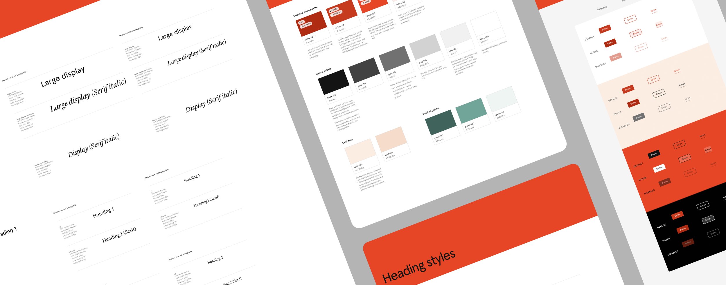
AEM design system
Building a flexible, accessible, and scalable infrastructure in Adobe Experience Manager (AEM)